There is one thing that I have noticed with websites that lately that really irks me, and piggy-backs on what we've been talking about. These days, any successful website needs to be responsive; Not only in content, but also in rendering to window/device size. Many sites (not enough) do make good use of media queries in their CSS to allow the browser to re-size with the correct device. However, what most sites do forget to do is have the image's properties correctly written to be responsive.
As chapter 8 discusses, images on a responsive site should have their max width set to 100%, and then be size constrained by x + y with a container. Most sites do not utilize such a simple, yet effective solution to the issues that most eventually run into or get complaints about. However, the sites you do see using it are often some of the most successful.
As our company is a jewelry retailer, I naturally keep my out on other top jewelry sites for good techniques specific to maximizing the quality of our product images. Of course, the model for most is Tiffany's. The first thing that I noticed when looking at their product images is that they always looked clear and crisp, not matter on what device or window size. They use a great combination of alternating image size and container size with media queries, and having the images set to max-width of 100%. This allows the load times to be the same on mobile devices while also getting the best image quality possible. At 100%, their images aren't the clearest images you've ever seen, but the way they are displayed on the page is well done to the point where you cannot tell the difference.
It's little techniques like this that are often overlooked, that can make a big difference in defining your brand/company over time; You may not see the result immediately, but there is definitely a big payoff for making sure the little details are perfect over time.
Sunday, November 23, 2014
Tuesday, November 18, 2014
Floats
Looking at what we've done in the past few weeks, I landed on some interesting information specifically related to floats.
Floats are considered the best way to space things horizontally instead of the default vertical stack. However, I'm sure we all know how awkward, buggy, and difficult floats can be to both learn and implement on complex websites. One of the biggest issues that one can run into when using floats is that they do not work well at all with containers. Since most websites these days (or mostly anything that is responsive) has a wrapper, this becomes a big issue. Although this issue can be fixed by using "clear: both;" with the container, that doesn't mean that that's the right way to fix it.
So I did a little more research to see if there was anything else out there, and I came across something interesting. You can use an inline-block display to accomplish this, and it actually works quite well with mostly all browsers. However, this technique tends to leave odd white space in between elements.
Flexbox, however, is the best alternative that I think that I've found. It allows you to space everything horizontally to the browser width and keeping said ratio at any screen size. I threw together a live example as a demonstration: http://www.michaelzapatka.com/flexbox.html
I honestly think is the best solution for a modern, mobile ready site. Its responsive and extremely efficient and easy to learn. Although my example is already responsive with wrap, I was going to put together a working example of an actual mobile layout, but then I found someone who already had (I don't want to fix it if it isn't broken): http://codepen.io/HugoGiraudel/full/qIAwr/
Not to curb my excitement about this, this will definitely be implemented and tested with my next project.
Sunday, November 16, 2014
Mobile, Mobile, Mobile
In today's world, it really is impossible to be successful without having a mobile ready site. I'm not talking about the folks who seem to think that they can hire a few Apple and Android developers to make a few apps...Im talking a completely functional mobile ready site.
Especially with the ease that CSS provides, nothing irks me more than seeing a lot (if not most) of the simplest sites not have a mobile version. Since when was it the standard to take a webstore that's 3 times as complex and give it a mobile site, but not have one for a simple informative page? I think despite the user demand that the site will achieve, I believe that a good web developer is always obligated to make the site, no matter how simple, compatible with all devices.
It's also of my personal opinion, that within the next year or so, most of the "apps" will be moving to web only. Platform specific apps are great, however unless you have a specific need to run on the devices runtime, it is quite time consuming and costly to build separate apps for Apple/Android/Google devices. With new technologies like material design with versatile and robust JS frameworks like Angular (https://material.angularjs.org/), I think that there will be a new standard of "web apps" to be put into use.
At the least, if you can't manage to complete a full-fledged web app or site, at least change a few important aspects, like buttons; There's nothing more frustrating than trying to click a link in your phone's browser that's the size of a grain of sand. Save us the yelling and angrily poking away at our phones and make something a little bigger.
Sincerely,
Everyone on the internet.
Tuesday, November 11, 2014
Positioning
In this day and age, I think that positioning is a huge building block for a website. It really decides how "portable" your site becomes; I'm talking about being mobile friendly. Now, of course mobile friendly can mean lots of scripting and completely rebuilding the entire page based on where you're viewing it from. However, even the most basic sites can become mobile friendly.
It's quite easy to define a max-device-width in your css, and allow your layout to become responsive to your browser window size. This allows you to swap styling, spacing, and positioning as soon as you go below a certain width. Now in reference to layout, having a layout like this may be ideal on a browser bigger than 600px:


It's quite easy to define a max-device-width in your css, and allow your layout to become responsive to your browser window size. This allows you to swap styling, spacing, and positioning as soon as you go below a certain width. Now in reference to layout, having a layout like this may be ideal on a browser bigger than 600px:
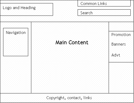
However, on a window half that size or less, none of that is going to be remotely readable or easy to navigate. This would require you to change your layout to something more manageable for a smaller area, like this:
This re-arranges content blocks to utilize more vertical space than spacing everything out horizontally. This allows users to find things easier because of bigger type and navigate easier because of larger links.
If you still don't know what I mean, try browsing your favorite commercial site with the desktop version selected, and you'll figure it out pretty quick!
Subscribe to:
Comments (Atom)