It's quite easy to define a max-device-width in your css, and allow your layout to become responsive to your browser window size. This allows you to swap styling, spacing, and positioning as soon as you go below a certain width. Now in reference to layout, having a layout like this may be ideal on a browser bigger than 600px:
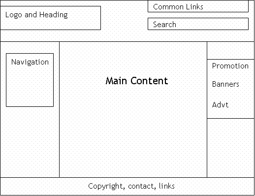
However, on a window half that size or less, none of that is going to be remotely readable or easy to navigate. This would require you to change your layout to something more manageable for a smaller area, like this:

This re-arranges content blocks to utilize more vertical space than spacing everything out horizontally. This allows users to find things easier because of bigger type and navigate easier because of larger links.
If you still don't know what I mean, try browsing your favorite commercial site with the desktop version selected, and you'll figure it out pretty quick!
No comments:
Post a Comment