After our classes this week focusing on forms and tables, I began to look further into the topic. Along with being confined to the constraints of a 2D environment, plain forms just don't draw your attention to want to be filled out.
I figured there must be much more creative options out there that have the functionality, but really draw your attention in. Along with just interesting me personally, we are also currently collecting data on a catch form for contact information at work, so I'm trying to find some creative ideas to implement.
In turn, I've found a gem this gem by a programmer from Japan: http://noht.co.jp/turnbox
This implementation of 3D buttons with multiple applications from contact forms to an uploader, is absolutely fantastic. Along with being awesome functionality-wise, it is SOOO fun to play with; I must have spent an hour just playing around with different configurations.
This may not make it to the catch form on the website, but it will definitely meet other awesome products down the road in my career. The great thing about a package like this is that it's well built and very seamless, and the design is very neutral. This will most likely to be around for awhile and see much more popularity down the road, so I'm happy to be able to share it with others and make good use of it before it's the latest "fad"... It's always cool in the development world to be able to say, "Back in the day, I was using that before it was cool."
Sunday, December 7, 2014
Sunday, November 23, 2014
Responsive Images
There is one thing that I have noticed with websites that lately that really irks me, and piggy-backs on what we've been talking about. These days, any successful website needs to be responsive; Not only in content, but also in rendering to window/device size. Many sites (not enough) do make good use of media queries in their CSS to allow the browser to re-size with the correct device. However, what most sites do forget to do is have the image's properties correctly written to be responsive.
As chapter 8 discusses, images on a responsive site should have their max width set to 100%, and then be size constrained by x + y with a container. Most sites do not utilize such a simple, yet effective solution to the issues that most eventually run into or get complaints about. However, the sites you do see using it are often some of the most successful.
As our company is a jewelry retailer, I naturally keep my out on other top jewelry sites for good techniques specific to maximizing the quality of our product images. Of course, the model for most is Tiffany's. The first thing that I noticed when looking at their product images is that they always looked clear and crisp, not matter on what device or window size. They use a great combination of alternating image size and container size with media queries, and having the images set to max-width of 100%. This allows the load times to be the same on mobile devices while also getting the best image quality possible. At 100%, their images aren't the clearest images you've ever seen, but the way they are displayed on the page is well done to the point where you cannot tell the difference.
It's little techniques like this that are often overlooked, that can make a big difference in defining your brand/company over time; You may not see the result immediately, but there is definitely a big payoff for making sure the little details are perfect over time.
Tuesday, November 18, 2014
Floats
Looking at what we've done in the past few weeks, I landed on some interesting information specifically related to floats.
Floats are considered the best way to space things horizontally instead of the default vertical stack. However, I'm sure we all know how awkward, buggy, and difficult floats can be to both learn and implement on complex websites. One of the biggest issues that one can run into when using floats is that they do not work well at all with containers. Since most websites these days (or mostly anything that is responsive) has a wrapper, this becomes a big issue. Although this issue can be fixed by using "clear: both;" with the container, that doesn't mean that that's the right way to fix it.
So I did a little more research to see if there was anything else out there, and I came across something interesting. You can use an inline-block display to accomplish this, and it actually works quite well with mostly all browsers. However, this technique tends to leave odd white space in between elements.
Flexbox, however, is the best alternative that I think that I've found. It allows you to space everything horizontally to the browser width and keeping said ratio at any screen size. I threw together a live example as a demonstration: http://www.michaelzapatka.com/flexbox.html
I honestly think is the best solution for a modern, mobile ready site. Its responsive and extremely efficient and easy to learn. Although my example is already responsive with wrap, I was going to put together a working example of an actual mobile layout, but then I found someone who already had (I don't want to fix it if it isn't broken): http://codepen.io/HugoGiraudel/full/qIAwr/
Not to curb my excitement about this, this will definitely be implemented and tested with my next project.
Sunday, November 16, 2014
Mobile, Mobile, Mobile
In today's world, it really is impossible to be successful without having a mobile ready site. I'm not talking about the folks who seem to think that they can hire a few Apple and Android developers to make a few apps...Im talking a completely functional mobile ready site.
Especially with the ease that CSS provides, nothing irks me more than seeing a lot (if not most) of the simplest sites not have a mobile version. Since when was it the standard to take a webstore that's 3 times as complex and give it a mobile site, but not have one for a simple informative page? I think despite the user demand that the site will achieve, I believe that a good web developer is always obligated to make the site, no matter how simple, compatible with all devices.
It's also of my personal opinion, that within the next year or so, most of the "apps" will be moving to web only. Platform specific apps are great, however unless you have a specific need to run on the devices runtime, it is quite time consuming and costly to build separate apps for Apple/Android/Google devices. With new technologies like material design with versatile and robust JS frameworks like Angular (https://material.angularjs.org/), I think that there will be a new standard of "web apps" to be put into use.
At the least, if you can't manage to complete a full-fledged web app or site, at least change a few important aspects, like buttons; There's nothing more frustrating than trying to click a link in your phone's browser that's the size of a grain of sand. Save us the yelling and angrily poking away at our phones and make something a little bigger.
Sincerely,
Everyone on the internet.
Tuesday, November 11, 2014
Positioning
In this day and age, I think that positioning is a huge building block for a website. It really decides how "portable" your site becomes; I'm talking about being mobile friendly. Now, of course mobile friendly can mean lots of scripting and completely rebuilding the entire page based on where you're viewing it from. However, even the most basic sites can become mobile friendly.
It's quite easy to define a max-device-width in your css, and allow your layout to become responsive to your browser window size. This allows you to swap styling, spacing, and positioning as soon as you go below a certain width. Now in reference to layout, having a layout like this may be ideal on a browser bigger than 600px:


It's quite easy to define a max-device-width in your css, and allow your layout to become responsive to your browser window size. This allows you to swap styling, spacing, and positioning as soon as you go below a certain width. Now in reference to layout, having a layout like this may be ideal on a browser bigger than 600px:
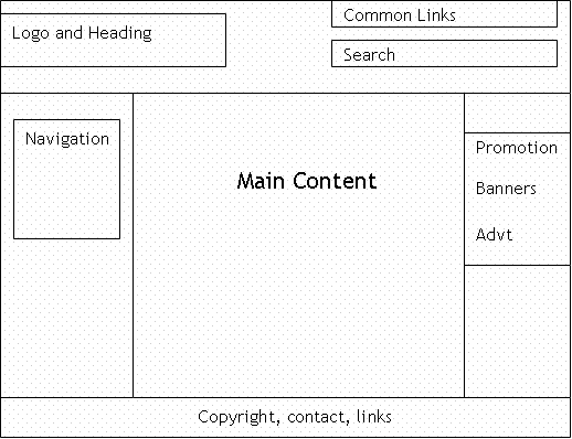
However, on a window half that size or less, none of that is going to be remotely readable or easy to navigate. This would require you to change your layout to something more manageable for a smaller area, like this:
This re-arranges content blocks to utilize more vertical space than spacing everything out horizontally. This allows users to find things easier because of bigger type and navigate easier because of larger links.
If you still don't know what I mean, try browsing your favorite commercial site with the desktop version selected, and you'll figure it out pretty quick!
Sunday, October 26, 2014
Flat Design
When we went over button design and the introductory options of what you can do with dynamic user input this week, that brought me to my most recent discovery: material design. Now, although this is a mostly experimental concept, I am already in love and can only expect a full implementation with all browsers/platforms by the end of next year.
Material design is not a new concept, but rather the latest take on everything good about web design. Google has taken a look at successful parts of web design, and combined then with where the web is going to be in the future, both feature and platform wise, and this is what they've come up with: Material Design by Google.
For me, this is the sort of look I've always liked. Less is always more in my book. Too many sites have too many mediocre features, when they lack the well-developed ones that most users rely on. Smart transitions and well thought out structure can go a long way in place of just packing as many cool features as possible into one page.
I'm currently working on a small app for a psychology class as a demo of an idea. Although it's still in the development stages, it really shows the idea of what I mean: Textion App (Needs Chrome 38+ to view on desktop or mobile).
It is simple, yet well-placed responsive touch points give user input some good feedback. Simple yet clean transitions give a nice feel on both desktop and mobile. Although this is only available in chrome since it's experimental, I feel like this can really be developed into the next big thing. This is practical, clean web app technology, which doesn't need any user downloads to run, and responds without any glitchiness on supports platforms.
We may not be out of the days of old css hover buttons, but I think we're definitely on the brink of some big changes with how desktop and mobile platforms are run.
Sunday, October 19, 2014
A Splash of Color
I believe that color in web design is very hingent on layout. In my experience, if I try to pick a color scheme before I have a solid layout, the color never really fits in the end product.
Color is like frosting on a cake. If you pick the frosting before you decide what flavor the layers are going to have, your cake could turn out very wrong: No one likes a carrot cake with strawberry frosting.
If your site is for an already established brand, you're most likely going to have your palette already picked for you. However, if this is a establishing brand/concept, your color choice is going to be very important for the future and growth of the business/idea. Just like typography, color can make or break the recognition and credibility of whatever you're designing for. Coca-Cola probably wouldn't be as recognized as it is today had the logo been, say, brown and green. In my opinion, colors should always reflect your emotion for whatever you're designing for. Almost like some people look better in a pinstripe vs. solid suit, some logos/layouts/designs look better in certain colors.
No matter what color is picked, you have to be happy with it. I've noticed if I'm being swayed to choose a set of colors that I don't like for a project, it usually doesn't come out looking good. However, when I have a set of colors in mind, I often end up with a genuinely solid end product that everyone's happy with. What some people forget is that although they might like a certain color, it may not fit what the designer is laying out. Most often, as I'm finishing a layout, I can start to envision what I want for colors. If I put someone else's color choices in, they generally don't work very well, since the layout complements the colors that it's been designed with in thought.
This doesn't mean that you shouldn't consider advice and constructive criticism on color choice and all other aspects. It just mean's that although changes can be made, its probably not wise to throw a completely different color scheme into a project at the last minute; You're most likely going to lose more than you gain.
Sunday, October 12, 2014
Typography and SMB
One of the things that I really think makes a website is typography. For me, it really defines the site as being average, or setting the bar for its kind. Although there are many fonts that you can download and embed from your hosted server, I am really liking the newer trends in typography.
Google fonts, I've found, are some of the most reliable options to use. Especially when you're working on UI applications, where visibility and coherence is priority above style, web specific fonts are the best choice. Google has a fantastic realm of hosted fonts to include, and contain most web versions of basic faces that you need in the web world (both serif and sans-serif): http://www.awwwards.com/20-best-web-fonts-from-google-web-fonts-and-font-face.html
I always like to say I will leave my font choices until last...usually by that point, I've laid everything else on the site out and know what look I'm going for. If my project needs that last little touch, a few wise font choices will put the icing on the cake.
Since this is also supposed to be a blog about what I have learned in the past week, I also think it's pertinent to share this...even though its not directly from this class: When connecting to a Windows server from a mac, use SMB1. The 10.9 Mavericks upgrade includes the new SMB2 protocol, which completely shut down my Mac this past week...once smb drops the connection, it shuts down not only the program you happen to be using (in my case Photoshop), but also Finder, and all other core functions (you must use the units power button to force restart).
Although this is a bit of mixed information this week, I still hope it's useful....in a few different ways.
Sunday, October 5, 2014
Hard Decisions
This past week has been quite interesting with trying to complete our first project. It has been a bit of a struggle to find time to work on the site and get it to where I envisioned it originally. However, whats been most difficult to work through has been the challenge of working through the tough problems that come up in website development.
In this case, it was an issue of choosing between design and function. I had a vision of how I wanted the site to look, and spent a bit of time putting my thoughts together into a plan. Yet, even with planning, things do not go as you want them to. As I neared the end of the development project as I put everything together into the page, I discovered that there was an extremely small issue with the design that, even with being minuscule, was not going to fly for the final revision.
This led me to a hard choice. I could either change the design of the part that had the issue, or I could spend an indeterminate amount of time researching ways to fix the problem. I spent a bit coming up with design alternatives, but I'm the kind of person that sets their mind on something; Anything besides the original idea will just never look the same. So I decided to dedicate my time to trying to find a way to fix the issue, instead of opting for the less-attractive-but-simpler-to-implement design option.
In the end, and with lots of trial and error, I found a way to make it work. I was happy I spent the time that I did in order to get the site to be where I want to be. However, my mentality of striving to achieve perfection has led me to learn a few lessons: In this case, everything turned out ok since I had the time to spend on the issue. However, there will be situations where, when building a website, you simply don't have the time or resources to dedicate to working out all the issues you may run into with your build. Its at that moment where, as a designer, you must make a very hard decision; You either sacrifice your ideal design for something that has a little less wow-factor, or you end up with something that has a few loose ends. In my case, I always think of it this way: The website can look absolutely stunning...but if the user can't use it or a part of it, you might as well submit it to an art gallery, since that's about as much use that it will be.
Monday, September 29, 2014
Color in Web Design
Color in web design is something just as, if not more important than all other layout decisions. It can be extremely pertinent to the users decision concerning the credibility of your site, how attractive it is and therefore how interested the user becomes, and how it is used to highlight focus areas.


There are many parts of your site's layout that all work together to create an intriguing and informative site. However, if just one of those pieces are missing, the whole structure that you spent time to put together will collapse. Elements of importance include typography, color, shape, orientation to the users' perspective, etc. Every one of those pieces count. You can have great typography and layout, but if you make bad or obnoxious color choices, your presentation immediately loses brownie points.
For example, say we take a look at webmd.com:
The light blue tones convey a comfortable atmosphere; This is similar to the blue theme that you see in hospitals and doctor's offices.
However, if we took the same website and changed the colors to an obnoxious bright pink and green theme, the site not only becomes less credible, it also becomes a lot less comfortable. In my opinion, I'd also have a much harder time focusing on the content.
So all in all, when building a website, we must learn to take everything into account design wise and give each element an equal amount of planning and thought; If we spend enough time planning and executing with care, it may make all the difference in the long run!
Sunday, September 21, 2014
In creating this blog, I have come to realize how far some things have advanced since the last time I looked at them. Since Google has bought blogger, the interface has expanded much farther. You can now edit the raw HTML and CSS manually, to customize to your liking. I will definitely be doing this within the next week in order to really make the blog my own.
This past week's class has also led me to realize that there are definitely easier ways to go about certain things. In my development experience, I have traditionally had the mindset that as long as it works, it is good. However, I have worked with many languages from HTML and CSS to jQuery and PHP; This thought of mine does not work, especially for very extensive languages.
In class this week, I saw an example of a background animation that I would have previously figured would only be able to be built using a javascript based language. This instance, however, was built using only HTML5 and CSS3.
I suppose the biggest takeaway from this week's classes is that the more up to date you are with you languages, the better they can serve you ( and save you lots of time! ).
Subscribe to:
Comments (Atom)